01
Interior Cosmology
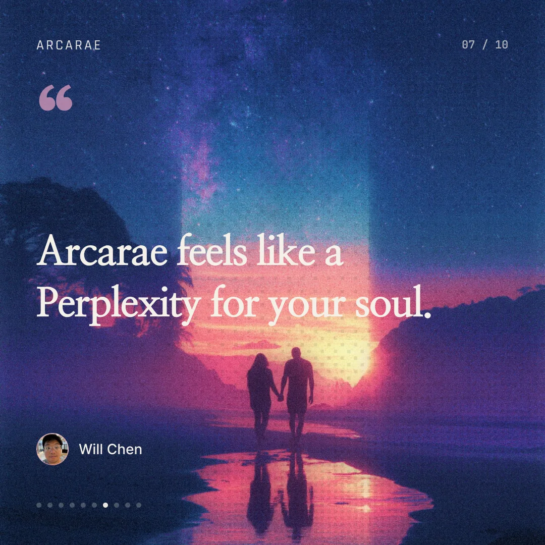
Silhouettes set against galaxies, with portals opening inside the body. The references treat the outer universe and the inner self as mirrors of each other.

✦Brand expansion & visual design
Brand expansion and visual design for Arcarae, an AI journaling app. I designed the App Store lockups and Instagram launch carousels, along with the visual language beneath them.
Case study by Sam Hayek·scroll to begin
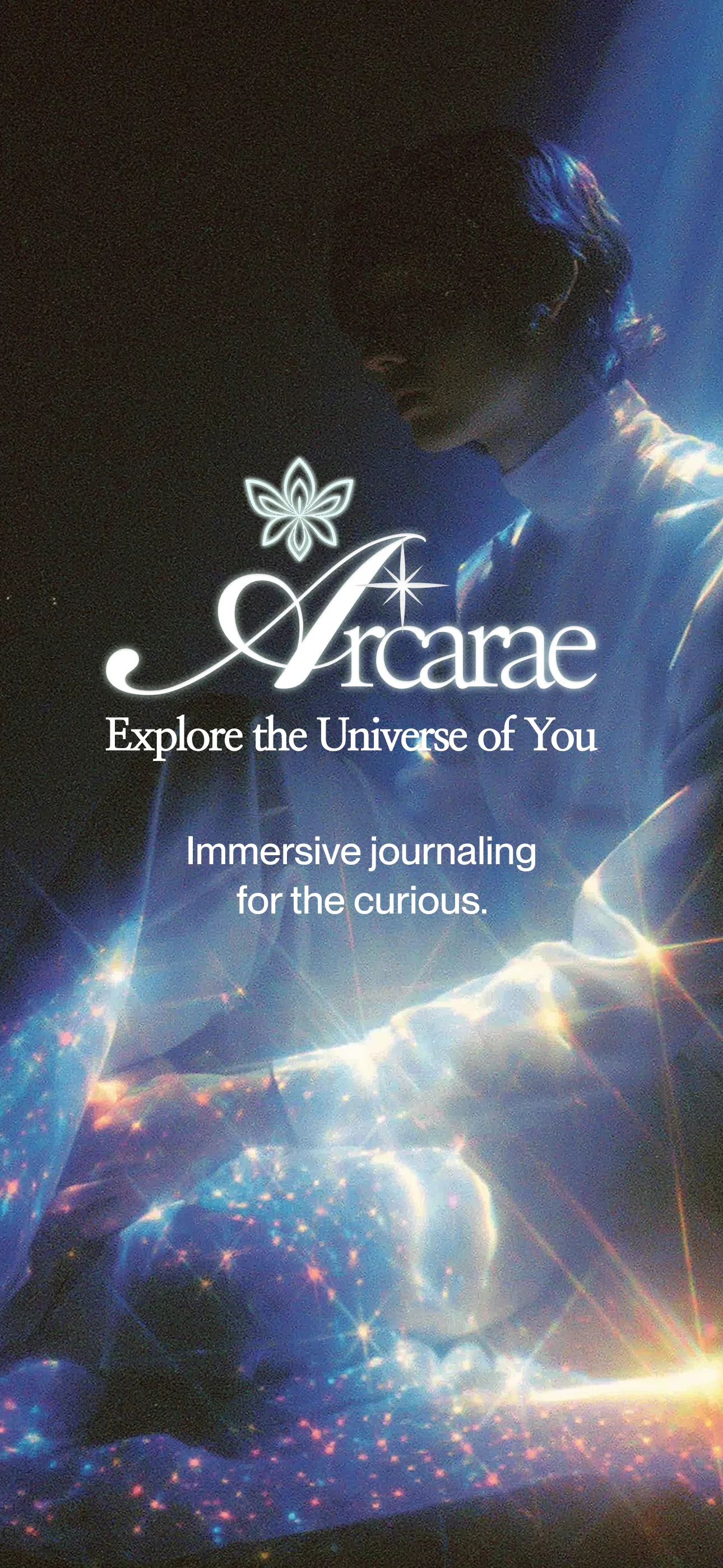
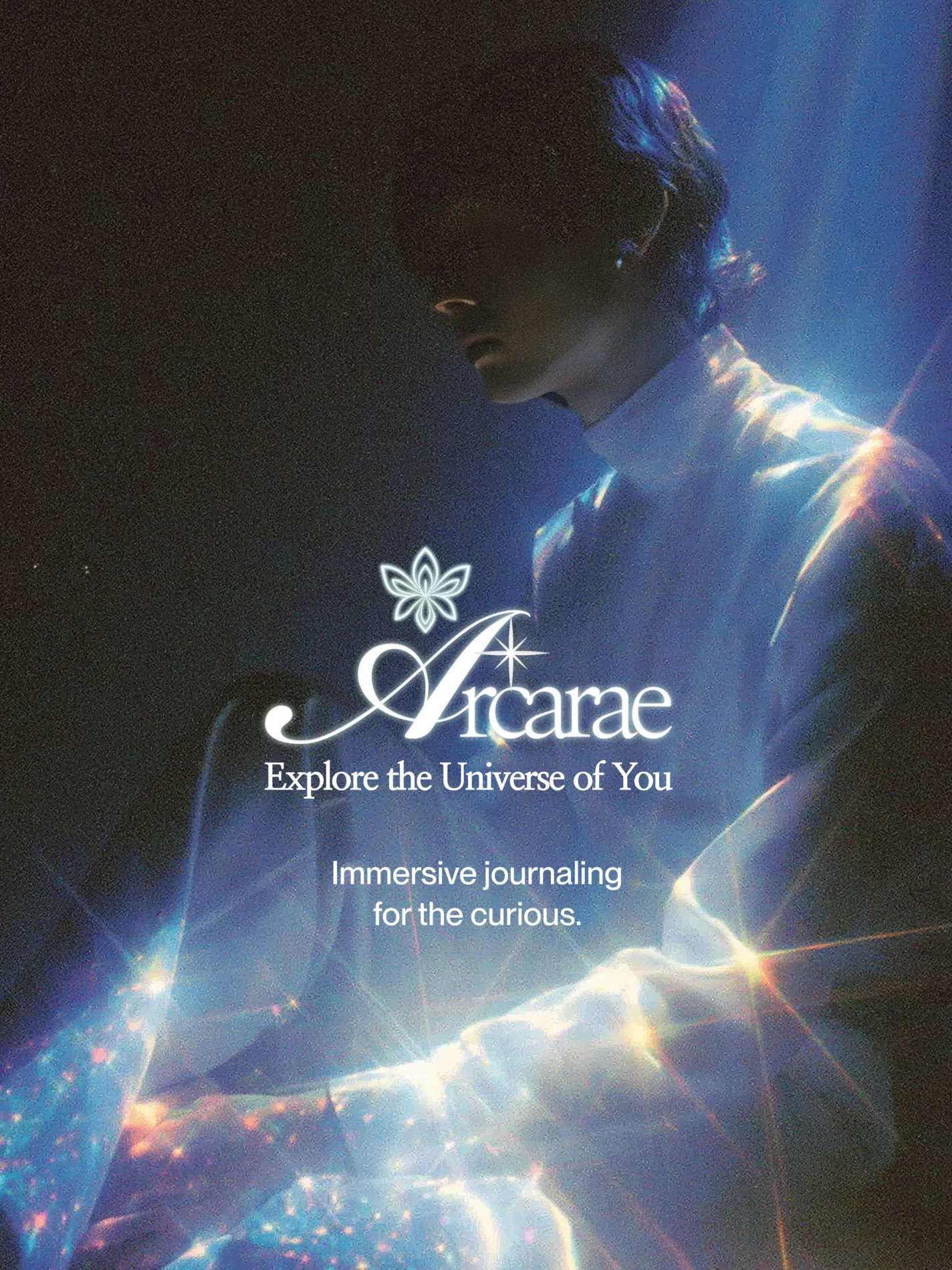
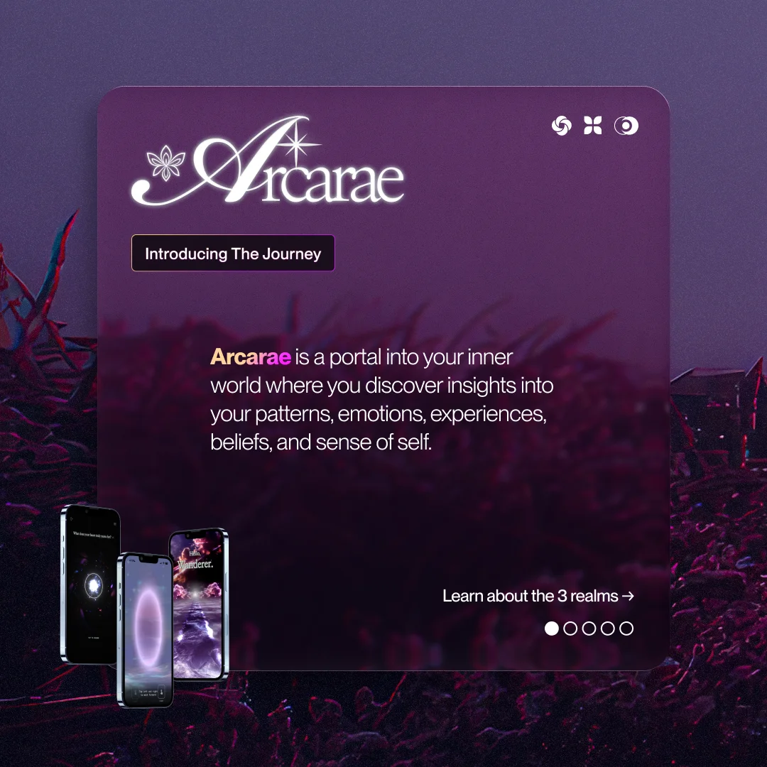
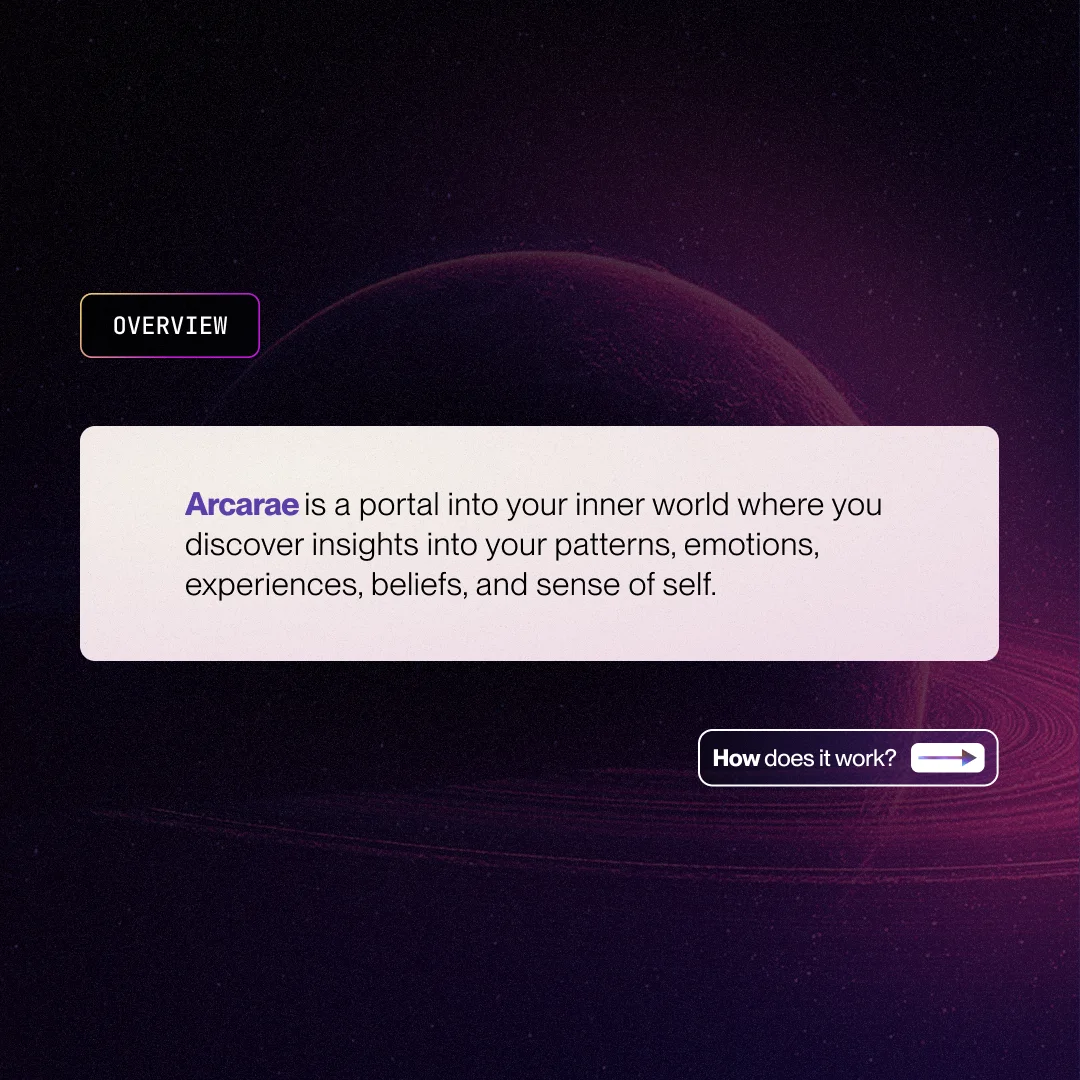
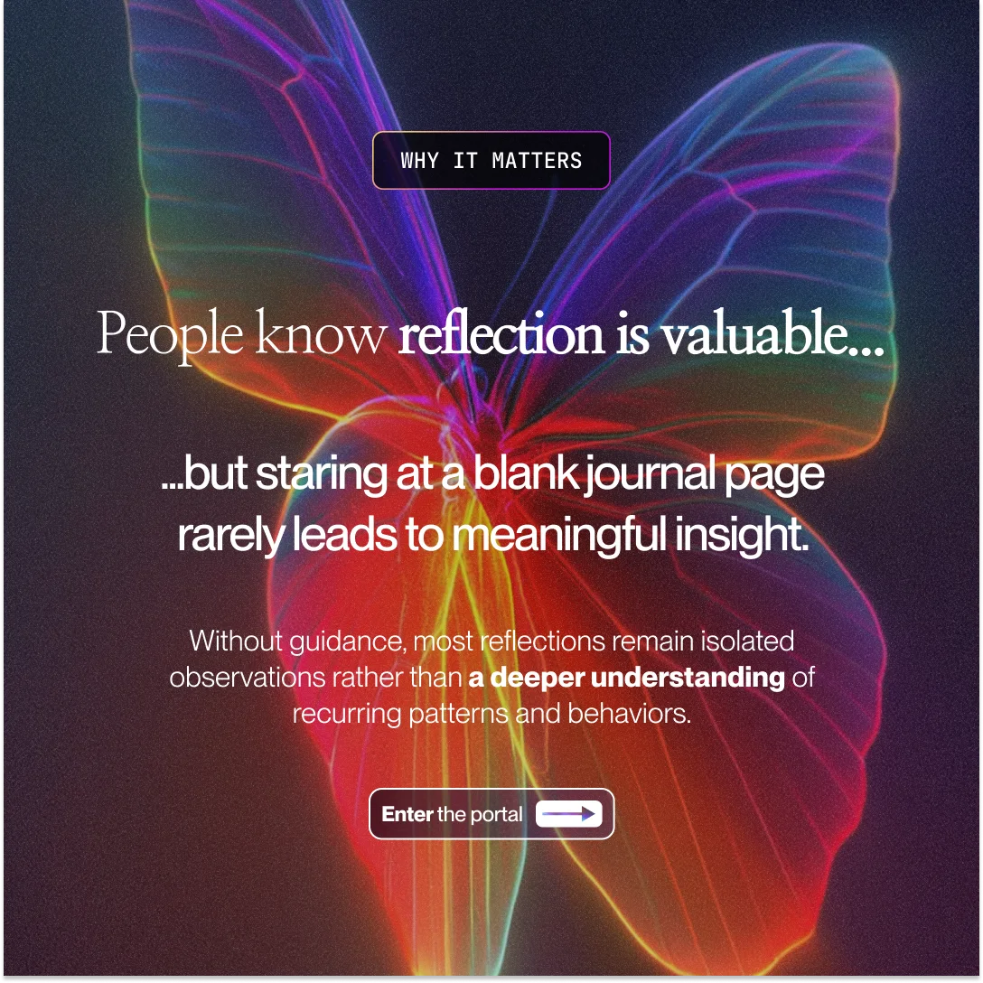
Arcarae is an AI-powered journaling platform that surfaces user behavior patterns. While the founder had a clear product vision and moodboards, the brand lacked a cohesive visual language.
The scope required producing App Store lockups and Instagram carousels. However, creating these assets required establishing the visual language first.
The core challenge was demographic positioning: the product's visual style leans feminine, but roughly half the user base is male. The visual language had to feel immediate and polished on the surface, yet universally accessible underneath. To achieve this, I reverse-engineered the recurring patterns in the founder's reference board before designing a single asset.
Concepts
explored
Directions
refined
Visual
language
App Store
screens
Instagram
carousels
Individual
frames
Deliverables
Contribution
Tools
01Moodboards
By analyzing recurring patterns across dozens of images, I identified four dominant visual signals.


Silhouettes set against galaxies, with portals opening inside the body. The references treat the outer universe and the inner self as mirrors of each other.
Aura glows, haloed edges, and bloom light around figures. Light emits from the subject rather than falling on it.
Liquid chrome type, zine collage, scanlines, and butterfly motifs. Spiritual content rendered with 2000s graphic intelligence.
Lavender, periwinkle, pearl, and blush recur as soft, holographic gradients. Color sets the mood before form does.
02Analysis
Six concepts, each pulling color, motif, and mood from the references in a different direction.

Feminine · Magical · Airy
The softest reading of the brand. Airy, feminine, and atmospheric, with the app framed as a place rather than a tool.

Clean · Precise · App-grade
Strips the mysticism and lets structure carry the meaning. Clean and app-grade, benchmarked against Linear, Arc, and Things.

Cosmic · Mystical · Poised
The balanced center. Cosmic and mystical, held with architectural restraint so it reads neither overly feminine nor overly technical.

Synthesis · Fluid · Both
A fusion direction built around one image: a liquid-chrome butterfly in an open hand. Soft and technical at once.

Submerged · Anime · Wildcard
A deliberate departure: underwater and bioluminescent rather than celestial. The most differentiated option in the set.

Chrome · Y2K · Devotional-tech
The sharpest, most parent-brand-adjacent reading. Chrome and Y2K, with spiritual content treated as an interface.
These started as exploration tools: a way to pull visual elements, color, and motifs out of the shared references. They informed the four directions I presented.
03Direction
I narrowed the six concepts to four and built each out far enough to actually choose: a 60/30/10 palette, a copy voice, a symbol set, and a body of art-directed, AI-generated imagery per direction.
Celestial · Devotional · Luminous
Bioluminescent bloom and butterfly motifs render the inner universe as soft and luminous.
The mind as a moment.


Prismatic · Spectral · Full-feeling
Emotion treated as a prism: the full spectrum of feeling rather than a single mood.
The mind as a prism.


Cosmic · Sublime · Vast
The self at cosmic scale. Ringed planets, horizon light, and lone figures.
The mind as a galaxy.


Cognitive · Architectural · Research-grade
Arcarae as cognitive architecture: data-dense, precise, and research-grade.
The mind as a system.


04Exploration
Every direction lived on a single working canvas before refinement: branding, the four visual languages with their generations, palettes, symbols, textures, and copy, side by side. These were drafts, not deliverables.
Explorations 01: the whole search on one page
Pan and zoom the live Figma file: explorations, lockups, and the social build, exactly as they were made. Use the page menu to move between them.
Source material · founder-supplied screens


Background plates · Midjourney, art-directed


 SamDesigner
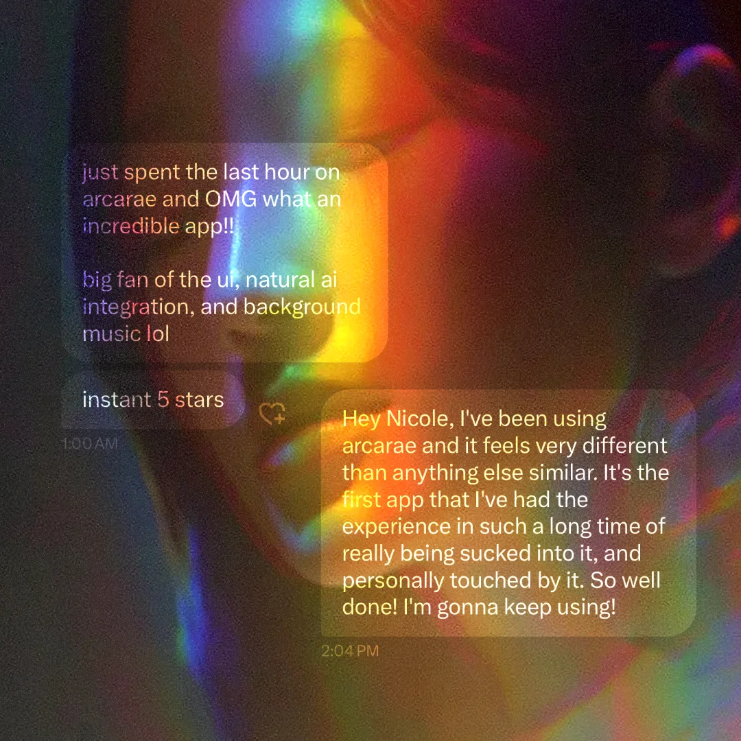
“The intention here is to, loosely, showcase different ‘voices.’ These specific examples were AI generated, and then edited.”
05Synthesis
The founder's feedback was specific. It described a composite direction, and I synthesized that feedback into the final system.
Astral's body. Aura's light. Nebula's voice.
What I heard: six signals
Astral is the base
Roughly 80% of the pull. The ethereal light and photorealism were working.
Neutralize ~15%
Astral leaned feminine, but the users split 50/50. Shift toward neutral while keeping the ethereal quality.
Infuse Aura's light
Blend a small % of gold/yellow to balance the palette.
Don't lean spiritual
The goal is clarity of self, made tangible. Whether it reads as spiritual is the user's call.
Nebula's voice landed
“Explore the universe of you” stayed; “Galaxy's internal monologue” was cut.
Synapse deferred
The cognitive/system themes didn't fit this scope.
06Visual language
One direction, fully specified across color, type, voice, and symbols: a reusable system that holds together across every touchpoint.
Aura's palette moves into the core. Off-white balances the cool cast. A small amount of warm gold rounds out the spectrum and neutralizes the feminine read; it appears as a glint or hairline, never a block.
Dream
#1F2B5C
60 · depth, gravity
Cosmic
#5B3FA8
30 · atmosphere
Heart
#E8A5C5
10 · warmth
Void
#0A0716
ground
Moon
#F5F1EA
surface
Aura
#ECC873
accent · sparing

Four typefaces, each with one job: a display serif, a body sans, a condensed face for system labels, and a monospace for data.
See yourself.
Nanum Myeongjo
Display: hooks, headlines, and brand moments.
Regular · Bold · Extra-Bold
Step into quiet.
PP Neue Montreal
Body and UI. The workhorse.
Book · Medium · Bold
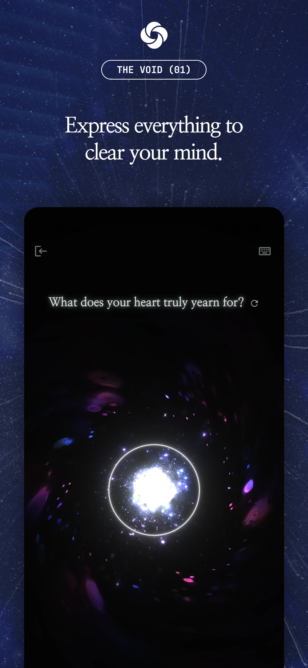
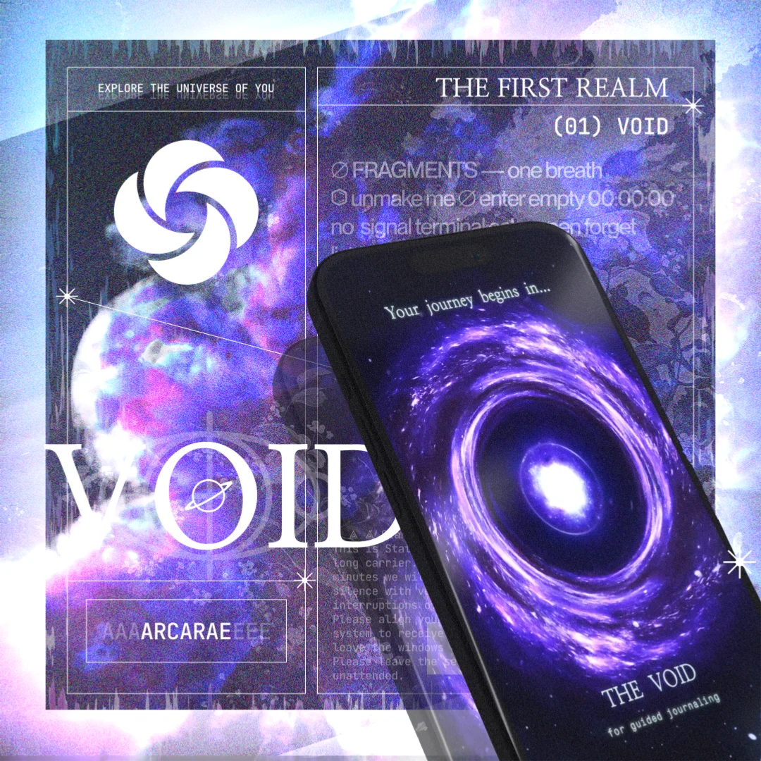
The Void (01)
Rajdhani
Technical: labels, tags, system marks.
Regular · Medium · SemiBold
00:14:52
JetBrains Mono
Data: timestamps, hex, indices.
Regular · Medium
The copy bridges emotional resonance and functional clarity. The messaging framework remains consistent across the App Store and carousel assets.
 NicoleFounder
“Arcarae is trying to dance the line of this + something more grounded. It's a bit hard to describe, but it can be seen as spiritual or not, as the user.”
Lean in
Avoid
Kept
Cut
Reusable structures
Instruction
You are allowed to ___, ___, and ___.
Identity
You are the ___.
Location
The ___ you seek is within you.
Self-address
I am ___ within ___.
Cosmic report
And the universe said ___.
Five structures. One voice. Endless lines.
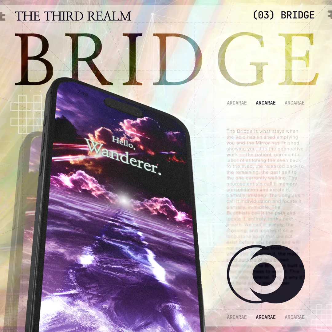
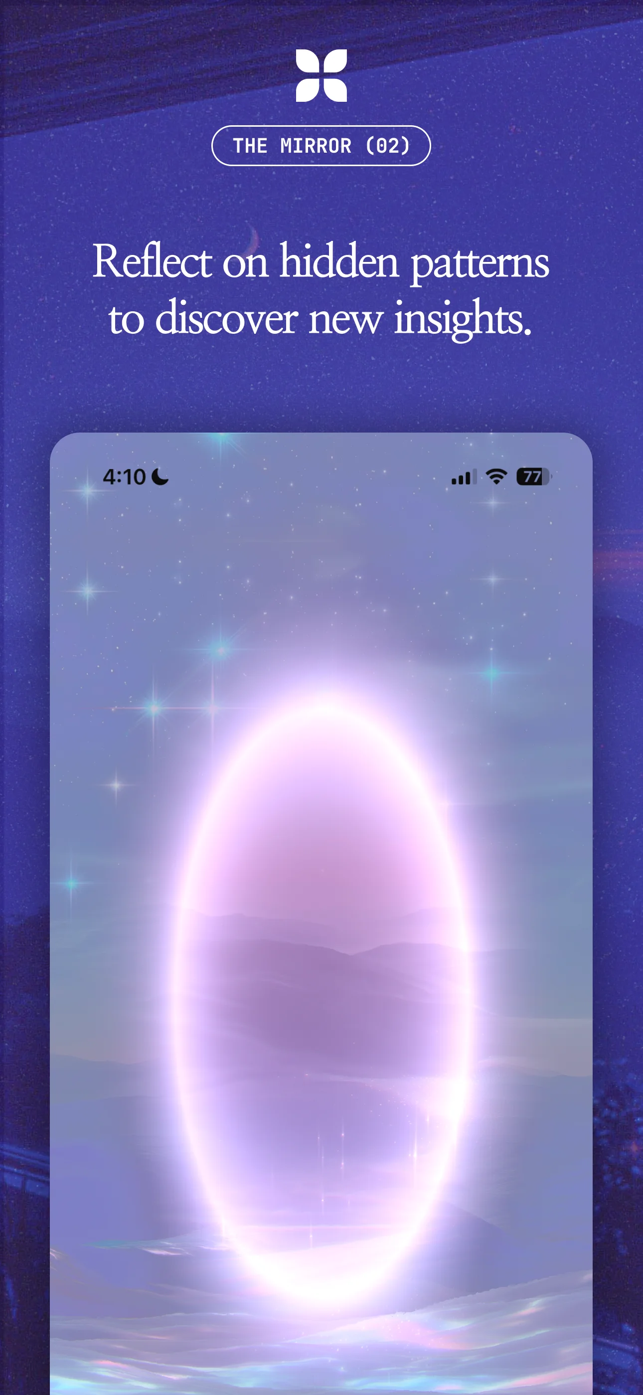
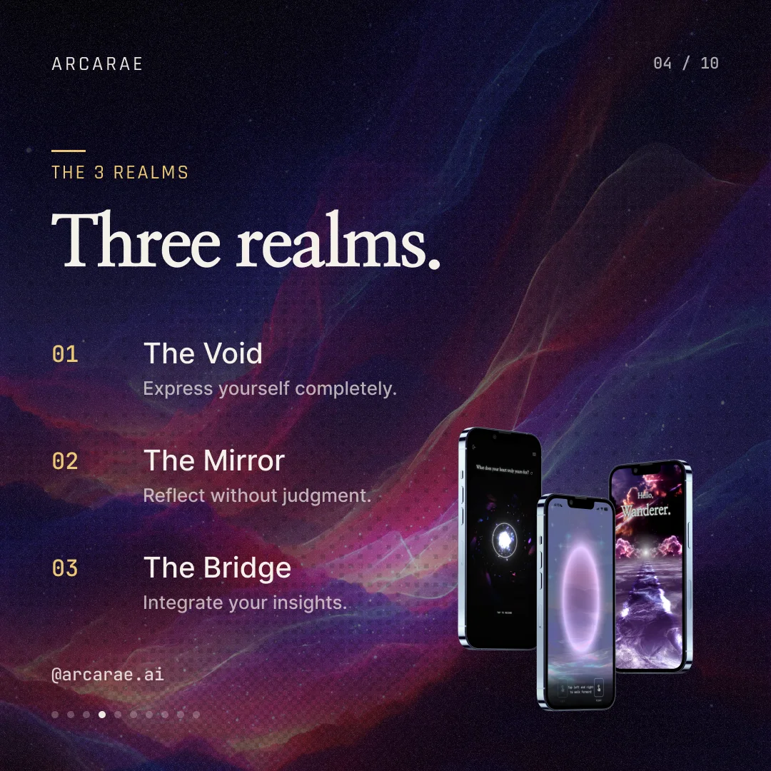
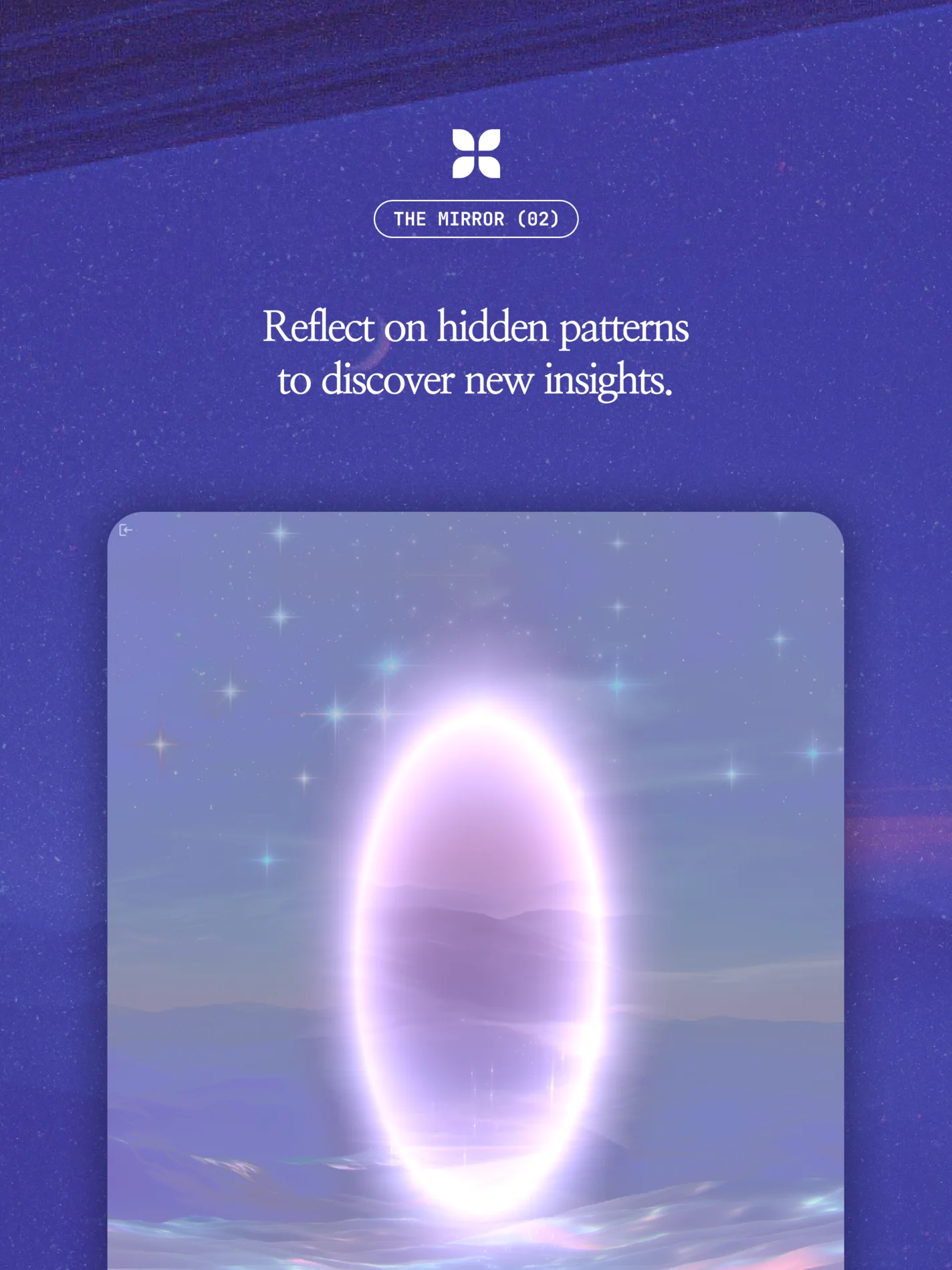
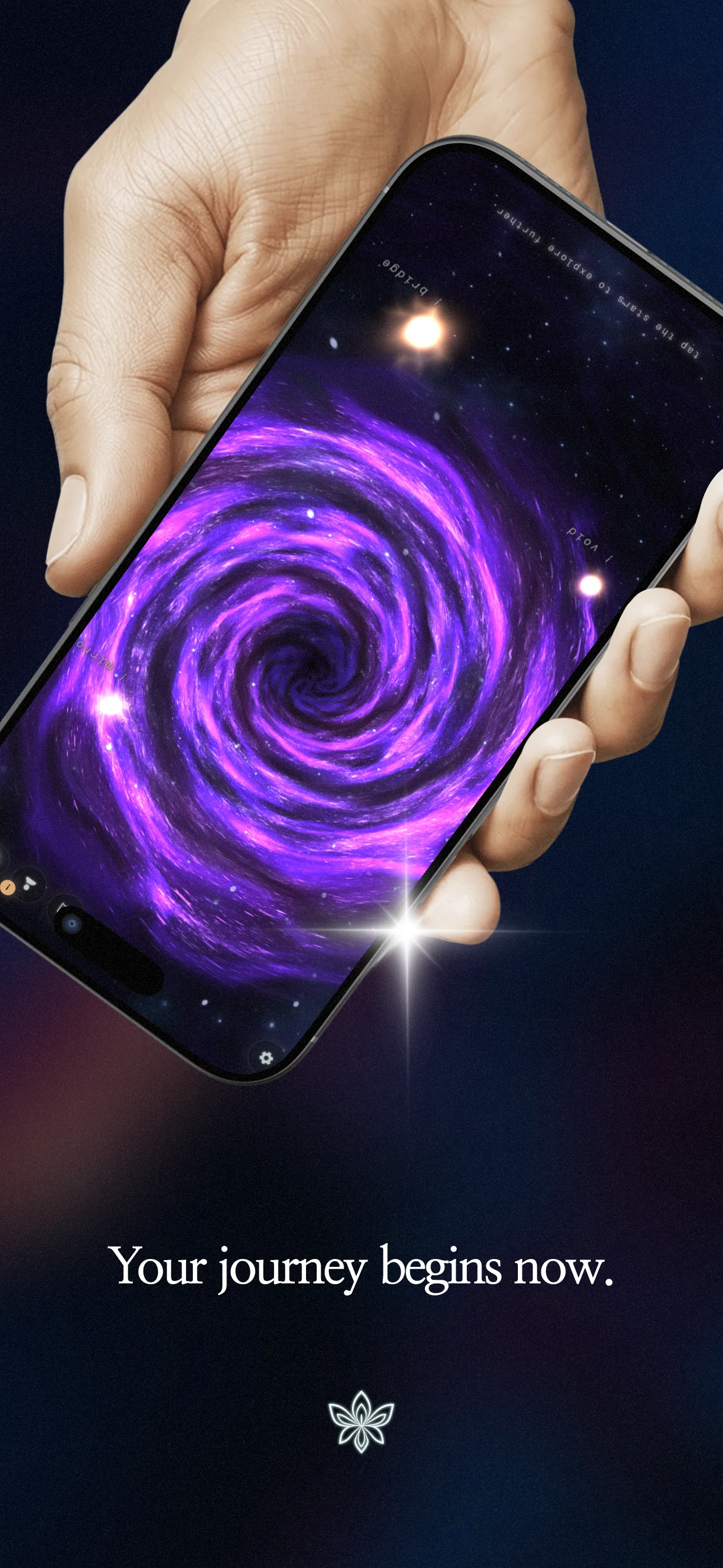
Three realms, three marks: an aperture for the Void, the bloom for the Mirror, and an eclipse for the Bridge. They draw from a broader symbol library.
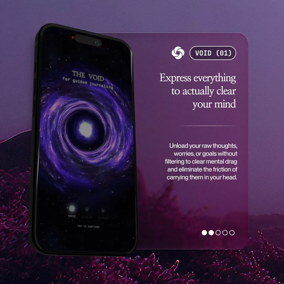
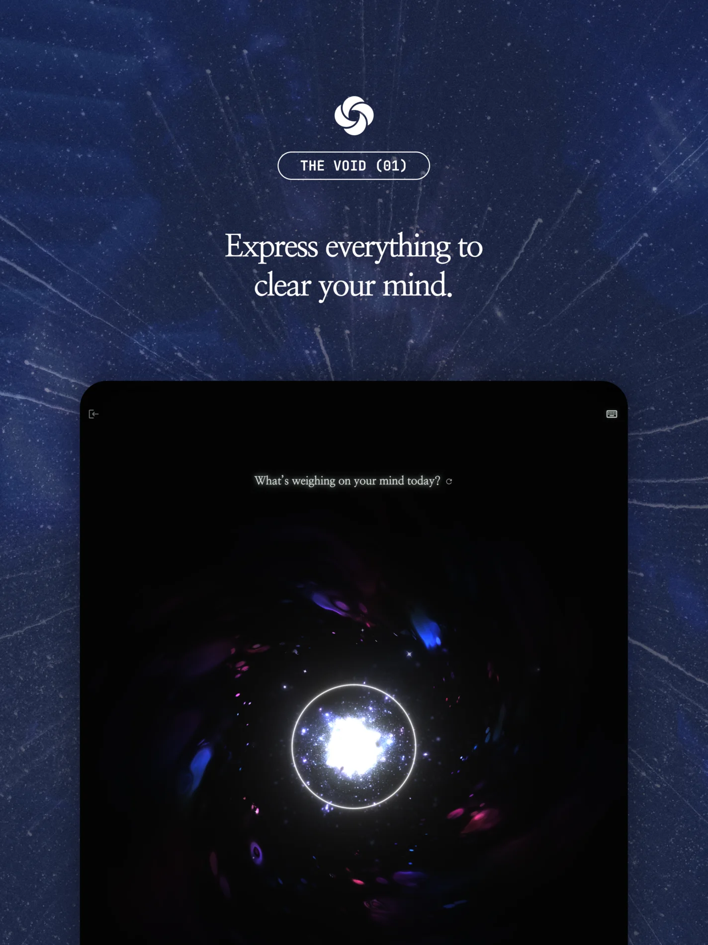
The Void
Express everything to clear your mind.

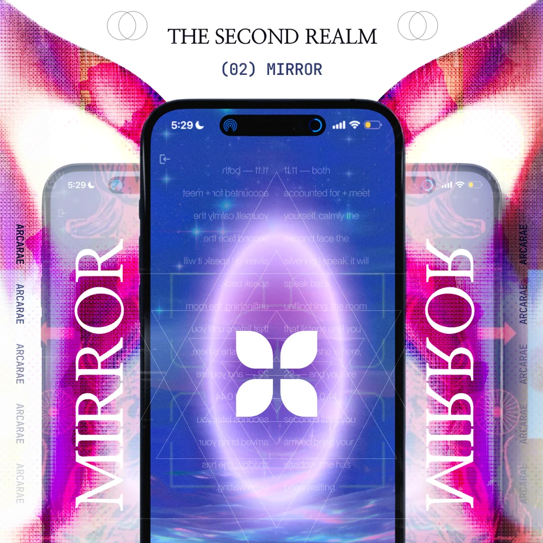
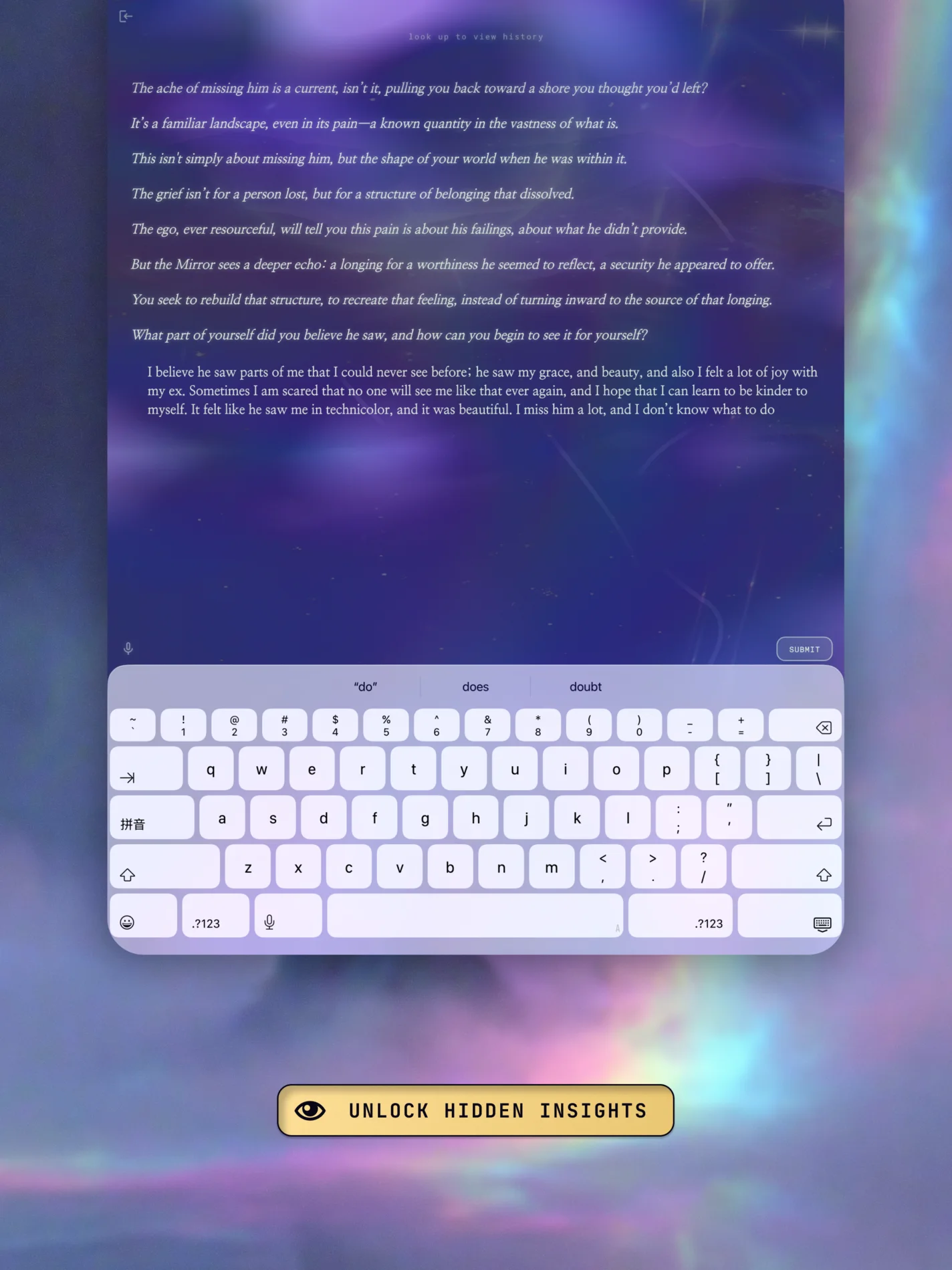
The Mirror
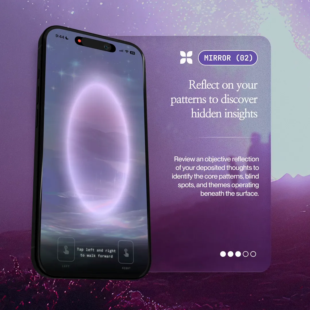
Reflect without judgment.

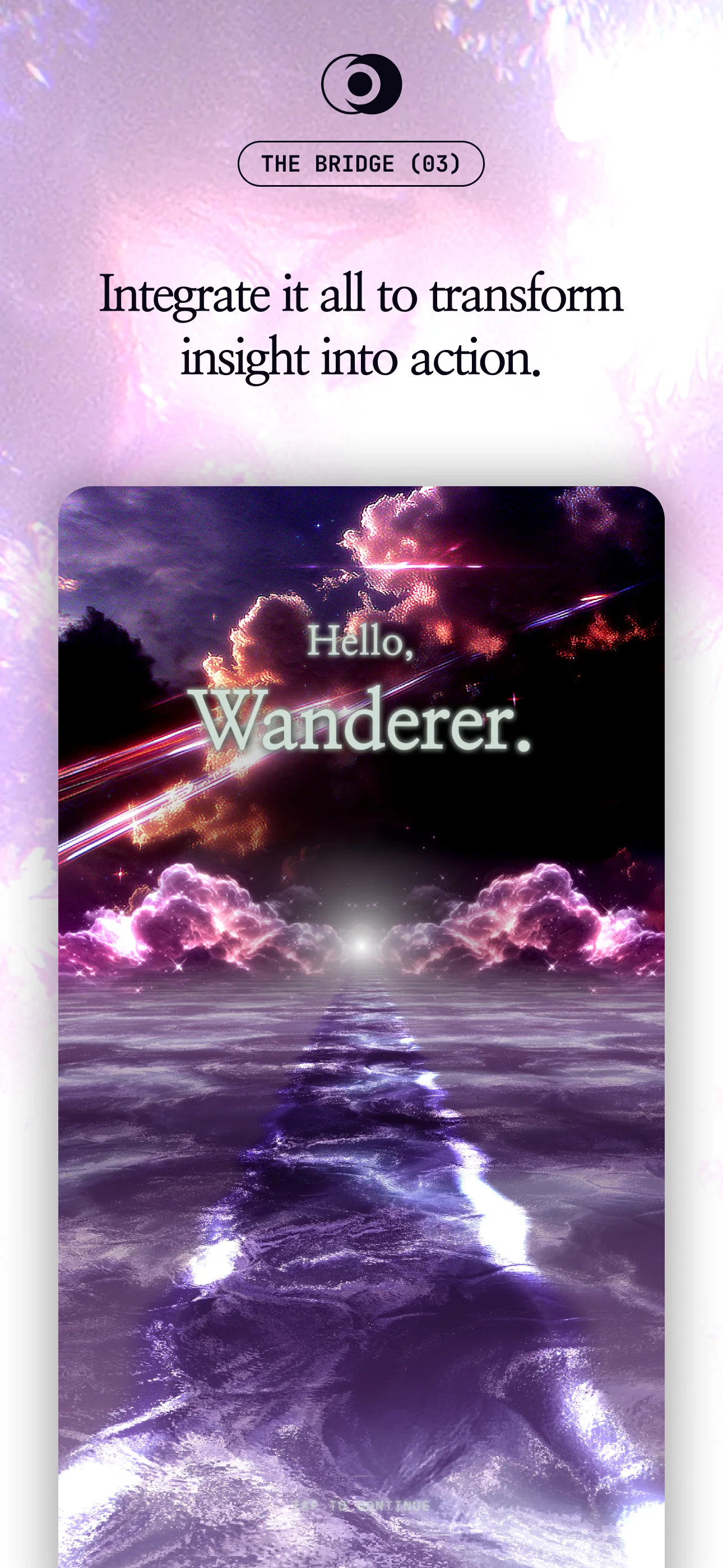
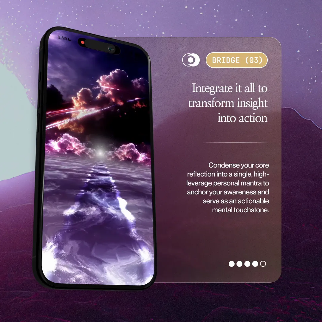
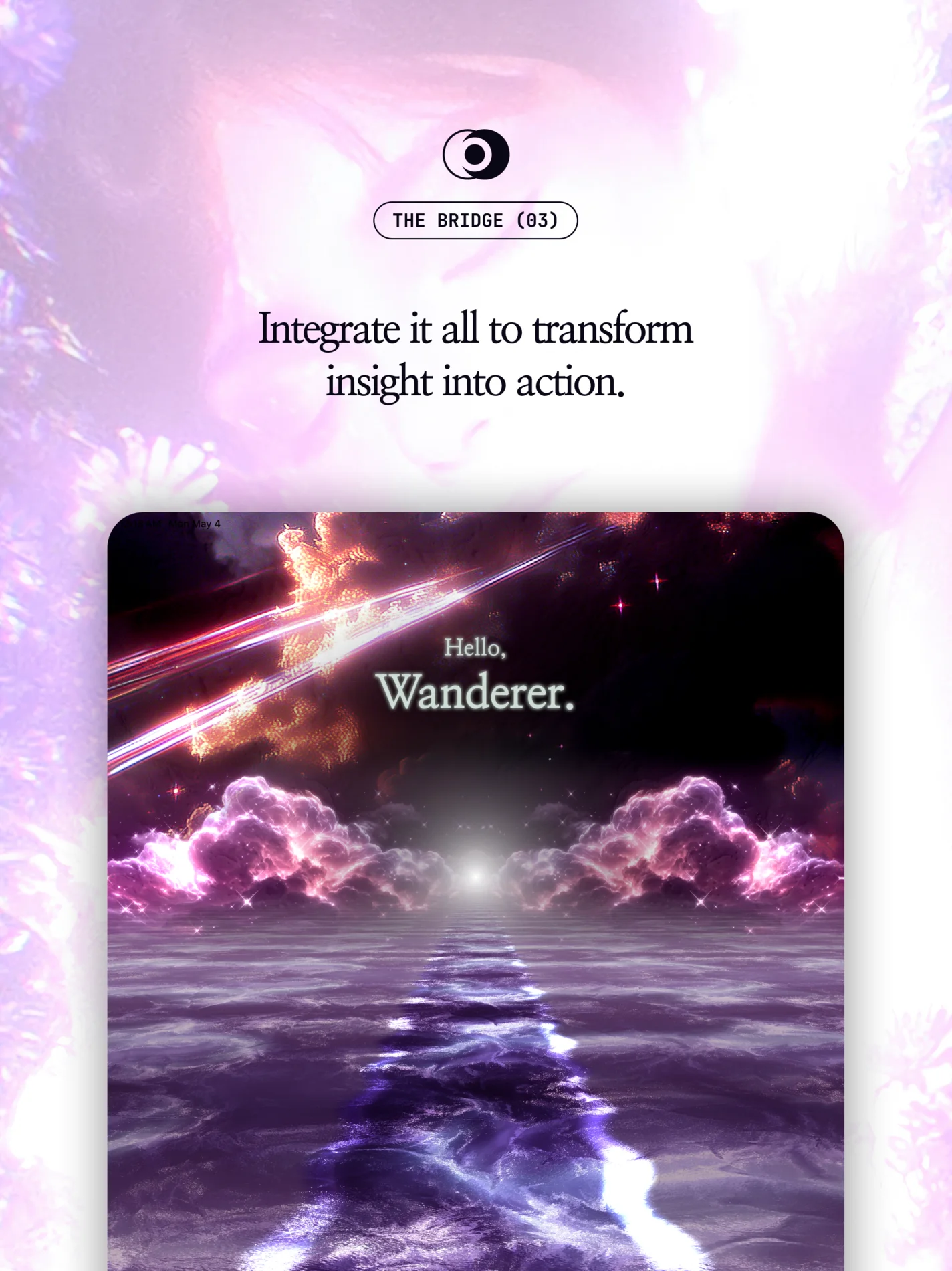
The Bridge
Integrate your insights.

The wider library
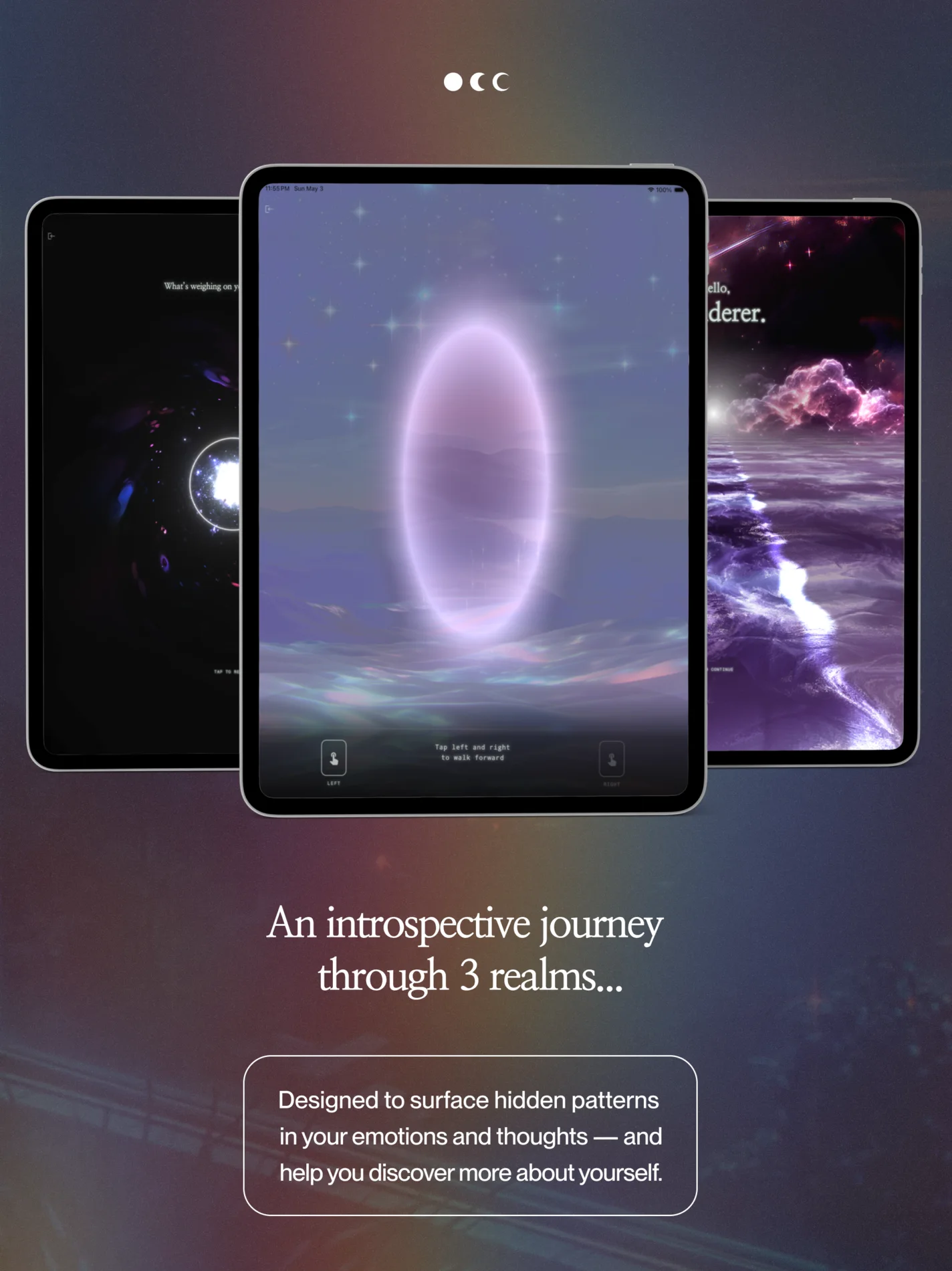
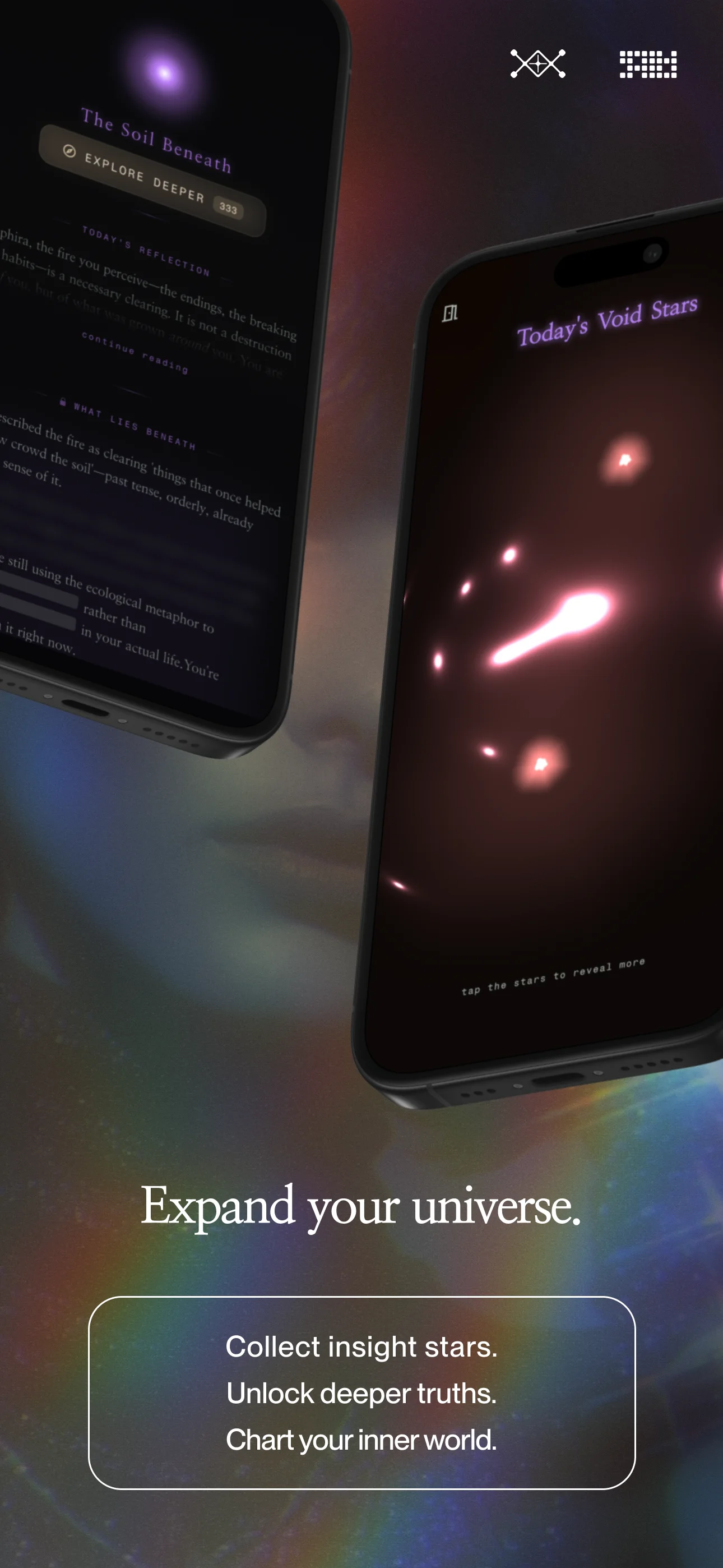
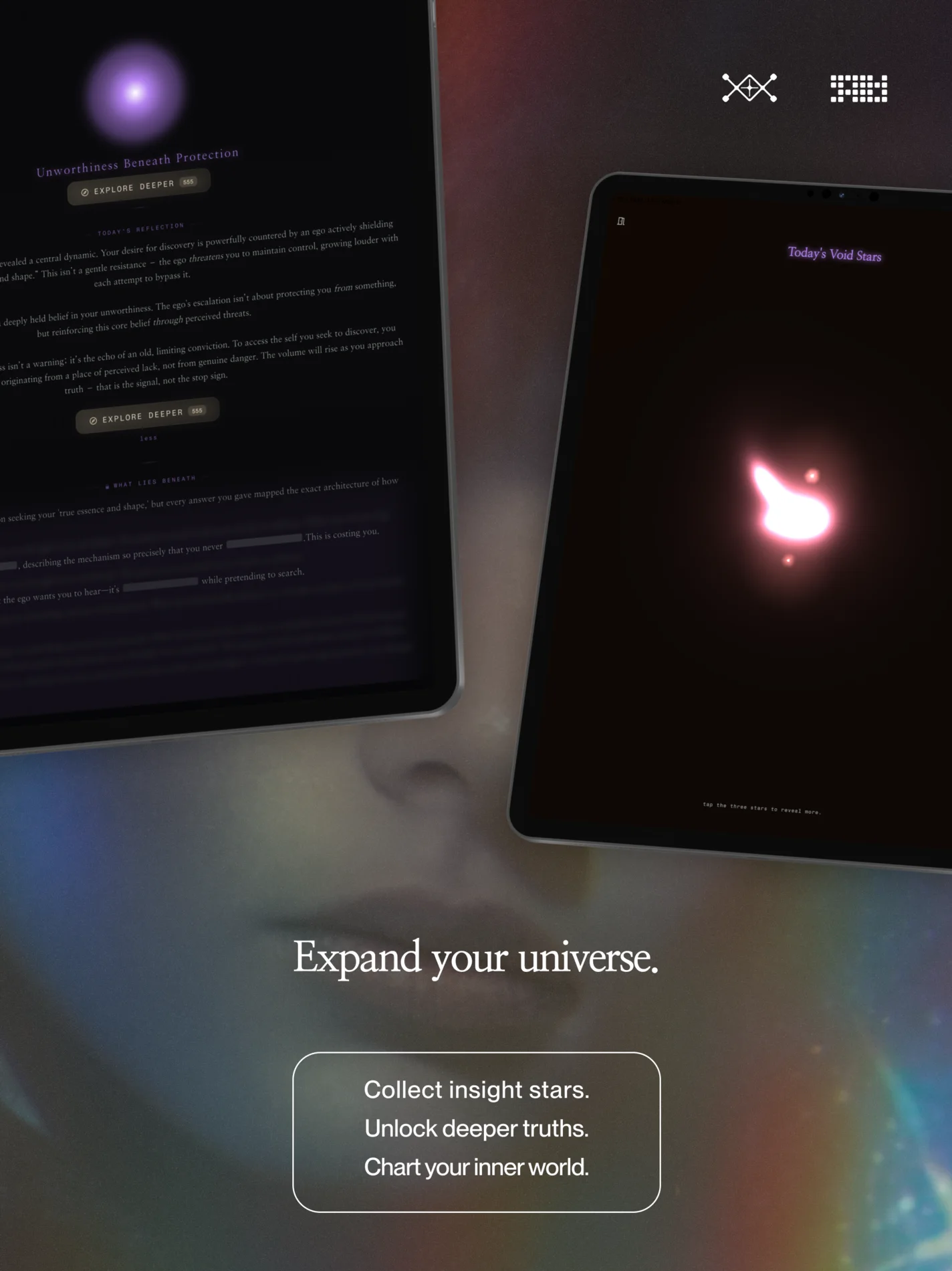
3D device mockups showcasing real in-app screens.


07Process
In-app screenshots are combined with generated art pieces, then digitally altered with blending, textures, and color treatment.
01Raw input
Founder-supplied app screenshots, chosen for the most atmospheric states rather than empty setup screens.
02Atmospheric plate
An art-directed Midjourney plate, built to frame the screen rather than compete with it.
 03
03Composited lockup
Screen, plate, type, and glyphs assembled to the system: emotional line above functional line.
NicoleFounder“I was thinking for the background maybe we could have it fit the current aesthetic a bit more (i.e., not as photo realistic, maybe more artistic).”
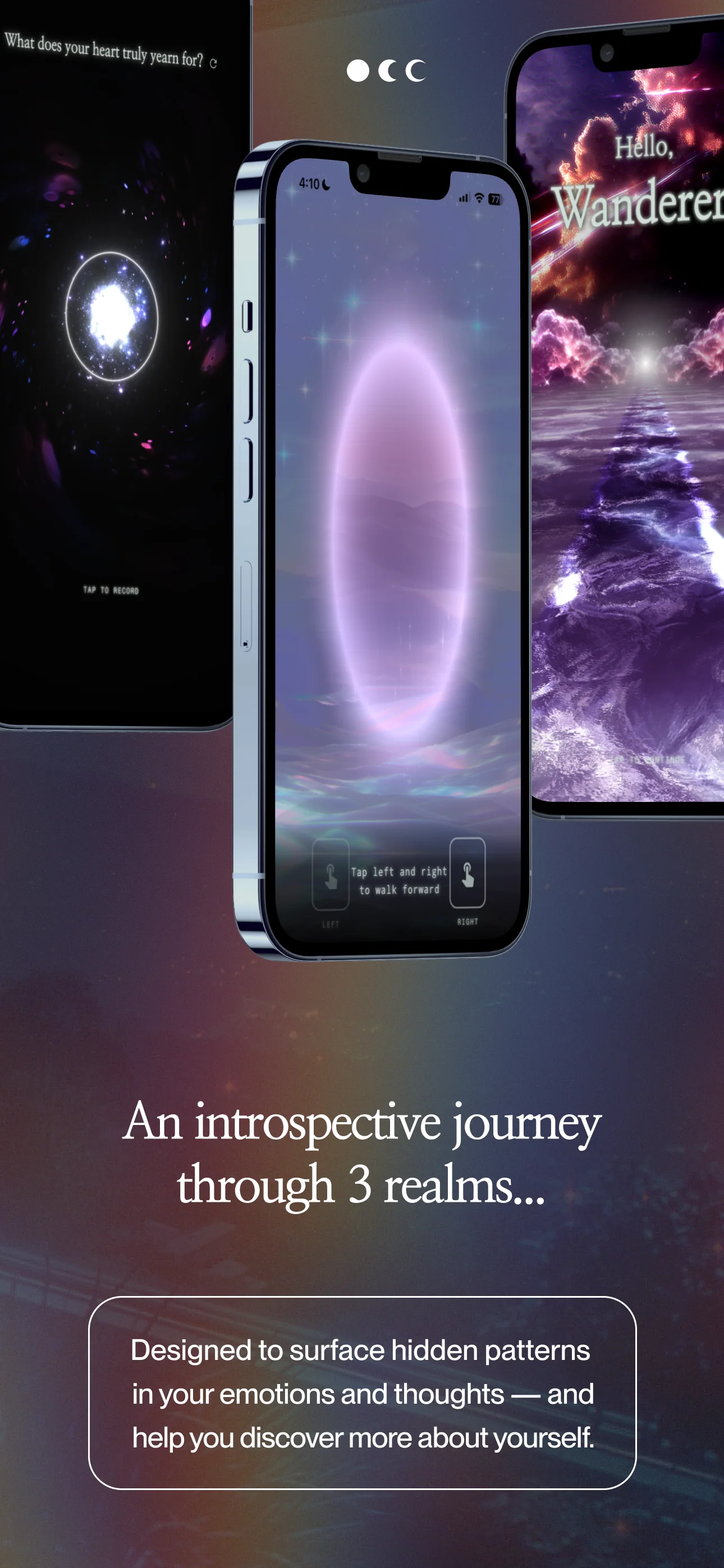
The animated carousel runs short loops pulled from the app, showing the three realms in motion. The last clip is an early motion experiment.
The stack
Figma
System, layout, and the phased production canvas.
Midjourney
The cosmic imagery. Hundreds of generations, sharply edited.
Affinity
Photo-manipulation: grain, bloom, light leaks.
Photomosh
Glitch and datamosh textures for the Y2K scanline and chromatic edge.
Rotato
3D device mockups; the angled phone renders for social.
DaVinci Resolve
Editing in-app screen recordings and compositing device mockups onto carousel images.
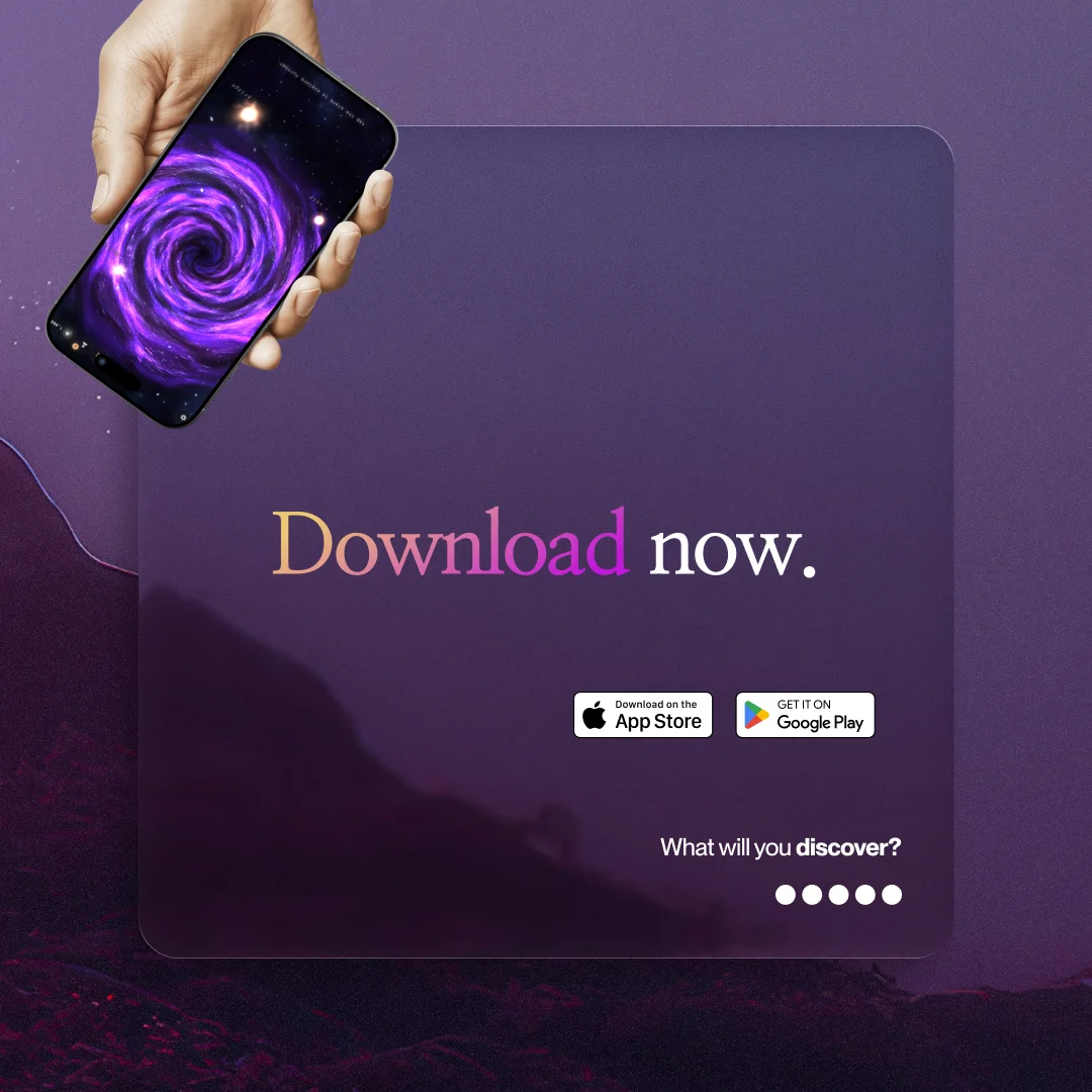
08App Store lockups
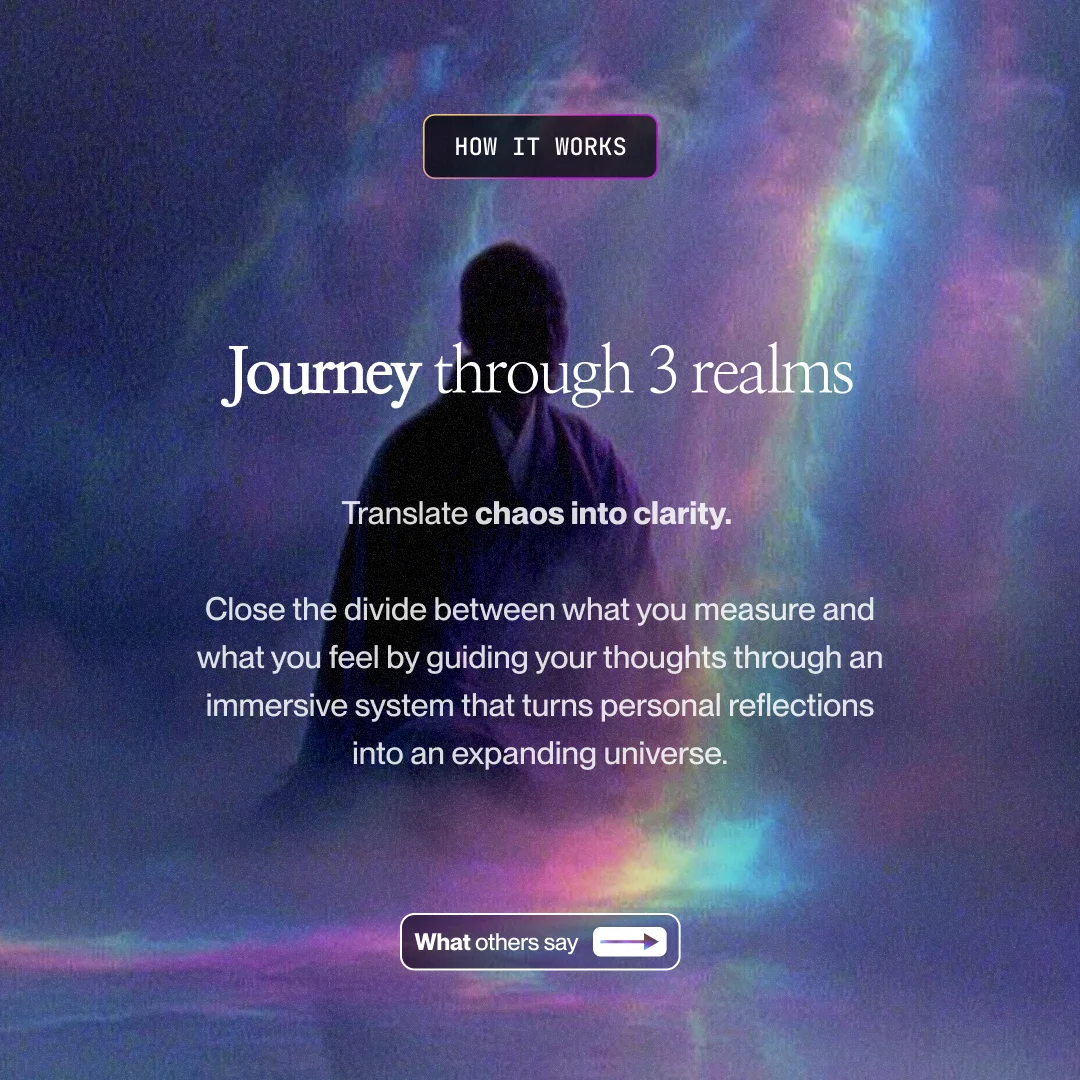
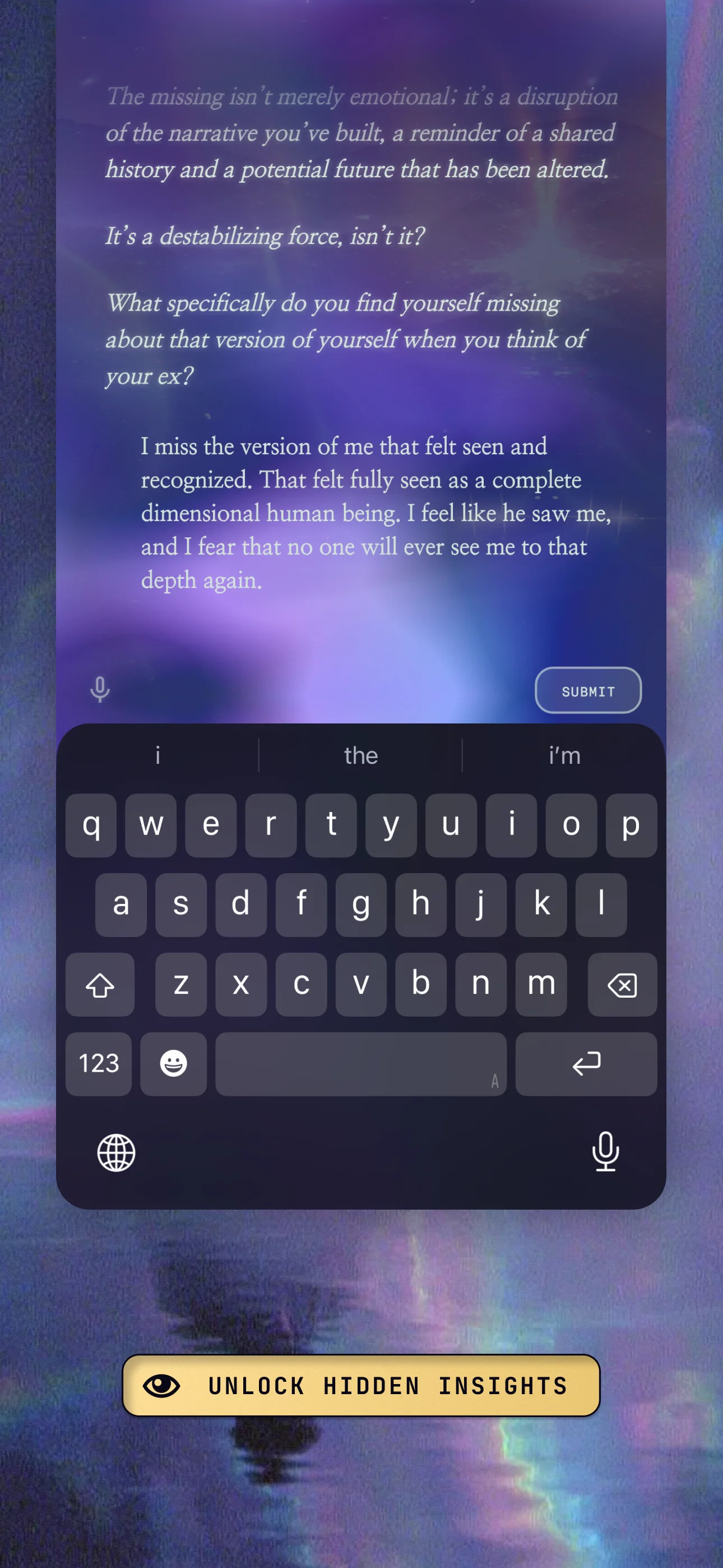
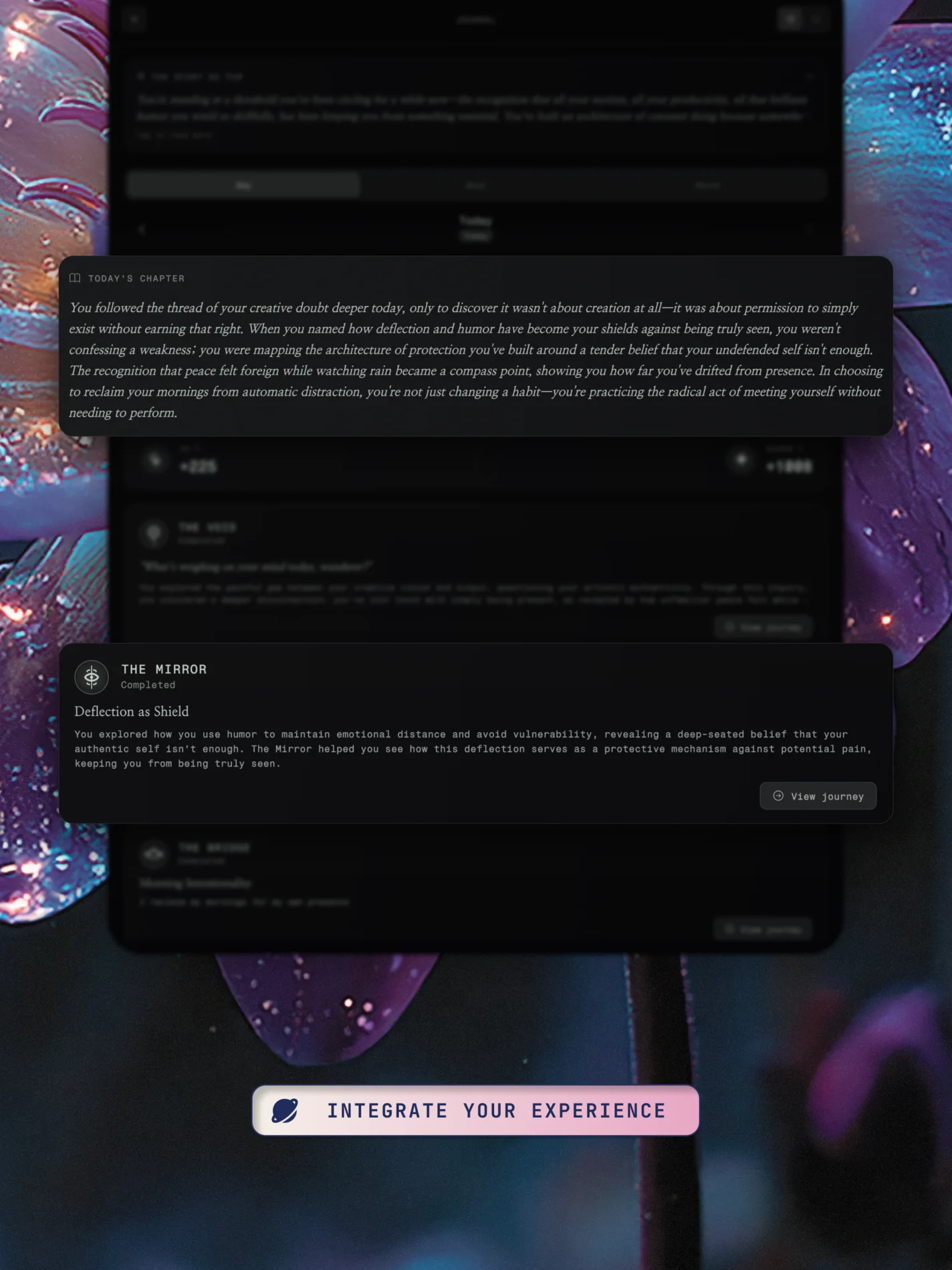
The flow has a clear arc: a hook to set the mood, three realm screens, and an invitation to close. Each realm states its use: the Void clears the mind, the Mirror reflects without judgment, the Bridge integrates insight.

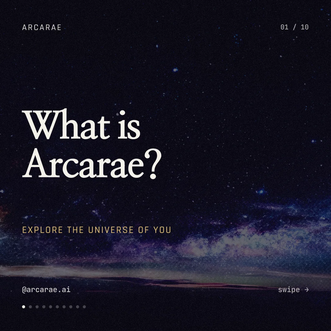
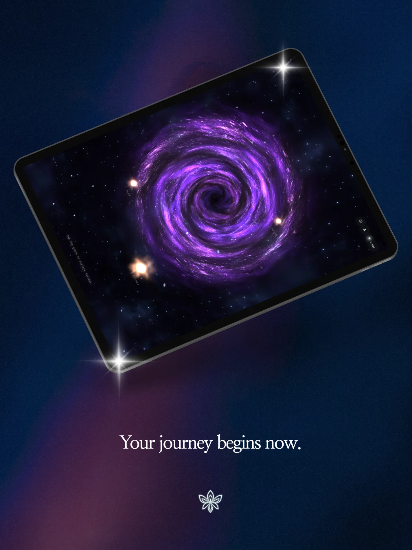
Explore the universe of you.
The atmospheric opener. Sets the mood and promises scope.
Step into quiet.
Space to notice what's there, beneath the noise.

See yourself clearly.
Reflection that gives language to what you've been carrying.

Carry it with you.
Turning insight into something you can act on.

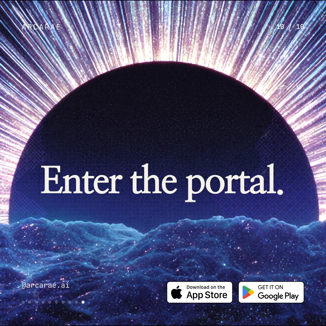
Begin where you are.
The closing screen. An invitation forward rather than a hard sell.
The copy logic
One line that resonates — functionally.
App Store browsers are evaluating an experience, not reading a manifesto. Affirmation alone fatigues across ten screens, and specification alone reads uninspired and dry.
NicoleFounder✓ resolved“Our tagline is Explore the Universe of You. So maybe we can use that here?”
Supporting screens


The copy stays consistent across devices while the layouts adapt to platform conventions, with more room for the imagery on the larger canvas.


Every screen and device, exactly as built. Pan the App Store page in Figma.
09Instagram carousels
A pinned-grid strategy across three posts: what Arcarae is, the three realms, and the proof. Each closes on the same call to enter the portal.
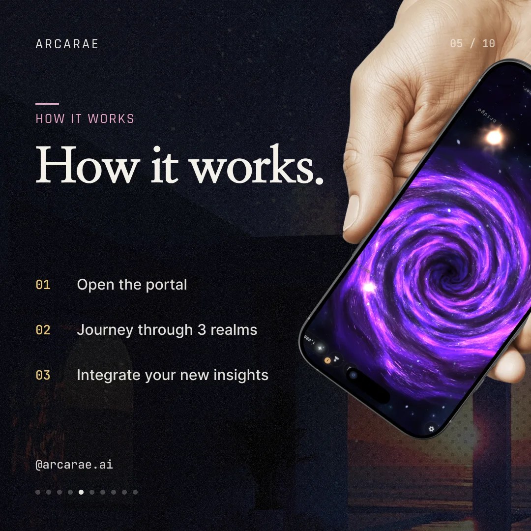
Animated · 5 slides
The product arc in motion. An intro and outro bookend three animated screens (Void, Mirror, Bridge), each a short loop pulled from the app.

 SamDesigner
“…the middle 3 slides (void, bridge, mirror) that showcase the phone mockup video.”
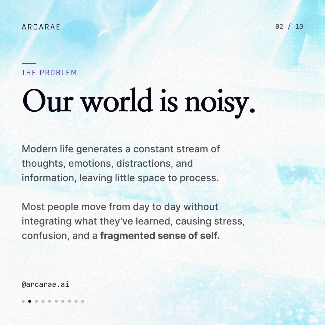
Static · 7 slides
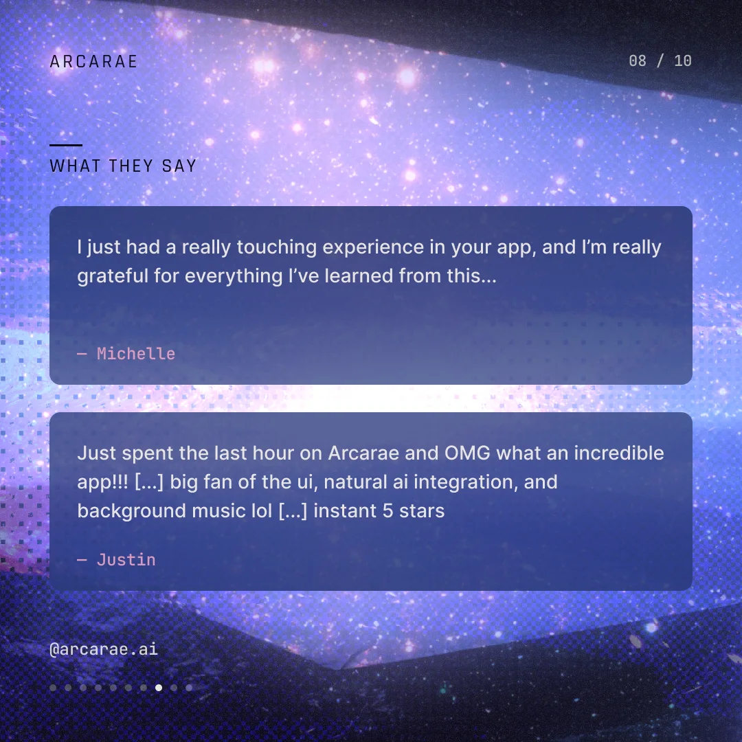
The explainer: overview, how it works, social proof, and the value proposition. Built to convert a cold scroll into an install.


 NicoleFounder
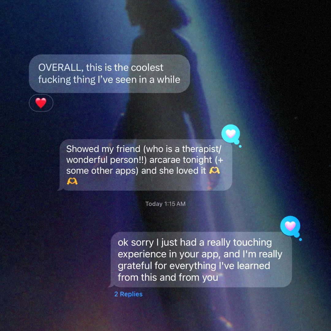
“This one is beautiful. Wow. Also the copy is really good.”
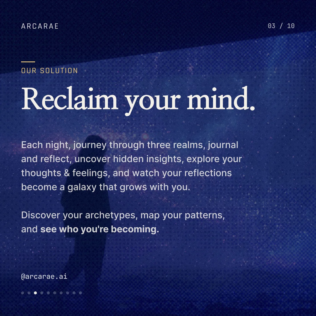
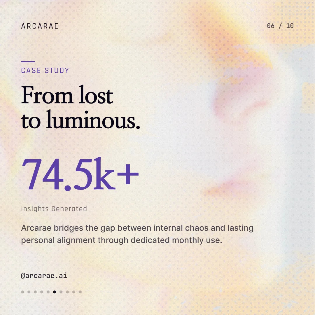
Static · 10 slides
The flagship post: cover, problem, solution, the three realms, a case study, testimonials, a stat, and the call to action. The full pitch in ten slides.


 SamDesigner✓ resolved
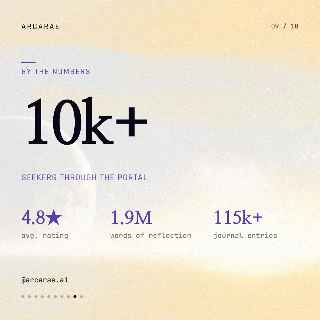
“Real data here would be great — numbers here make everything ‘tangible’ and create a sense of ‘trust’ that the app is worth downloading and using.”
Static · 3 slides
Single-frame posters for Void, Mirror, and Bridge, pushing the Y2K-zine treatment furthest.


 NicoleFounder
“I'm actually really digging these, wtf. These are so fucking cool.”
Phase 1 exploration, Phase 2 production, with final assets organized on the right. Backgrounds, text layouts, and format variants were discussed before being defined.
The Instagram canvas · concept → production → final
10Final assets
Nine App Store screens across two devices and all four carousels. 43 frames, in one consistent system.
11Summary
The original deliverables were the App Store lockups and four Instagram carousels. Producing them required building the visual language underneath: direction, palette, type, voice, and symbols.
App Store
screens
Instagram
carousels
Individual
frames
Visual
language
I started by analyzing the moodboards to identify the embedded attributes. From there I produced four distinct directions, which we synthesized into a new visual language.
NicoleFounder“I actually like this direction for the company itself vs. just the app. I'm blown away by all of this — would love to talk about company branding with you too.”
In her own words · 1:09
What this took
Research & analysis
Moodboards read for their embedded attributes, turned into a working brief.
Brand expansion & visual design
An existing brand extended inward into one app-ready visual language.
Art direction & image generation
Hundreds of generations directed, edited, composited, and color-treated.
Copywriting & strategy
A modular voice that holds across the store and the feed.
Video & 3D
In-app motion loops and 3D device mockups for the launch.